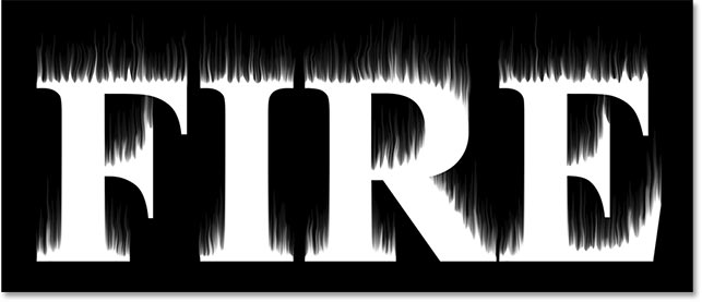
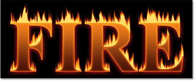
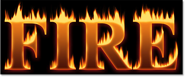
Photoshop fire effect

Step 1: Create a new Photoshop document
Start by creating a new Photoshop document. Go up to the File menu in the Menu Bar and choose New:
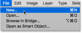
Going to File > New.
For this tutorial, set the Width of your document to 1600 pixels, the Height to 1000 pixels, and the Resolution to 72 pixels/inch. Leave the Background Contents set to white for now. And then to create the document, click Create or OK depending on which version of Photoshop you're using:
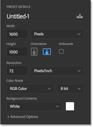
The new document settings.
Step 2: Fill the new document with black
Change the background of the document from white to black by going up to the Edit menu and choosing Fill:
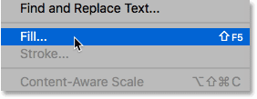
Going to Edit > Fill.
In the Fill dialog box, set the Contents to Black, and then click OK:
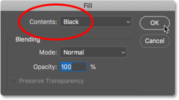
Setting Contents to Black.
Photoshop fills the background with black:
The fire text will stand out nicely against the black background.
Step 3: Add your text
To add the text, grab the Type Tool from the Toolbar:
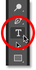
Selecting the Type Tool.
In the Options Bar, choose your font. I'll go with something simple like Times New Roman Bold. Set the size of the type to 72 pt just to give us the largest preset size for now:
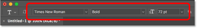
Choosing a font and type size in the Options Bar.
Still in the Options Bar, set the type color to white by clicking the color swatch:

Changing the color of the type.
And then choosing white in the Color Picker. Click OK to close it:
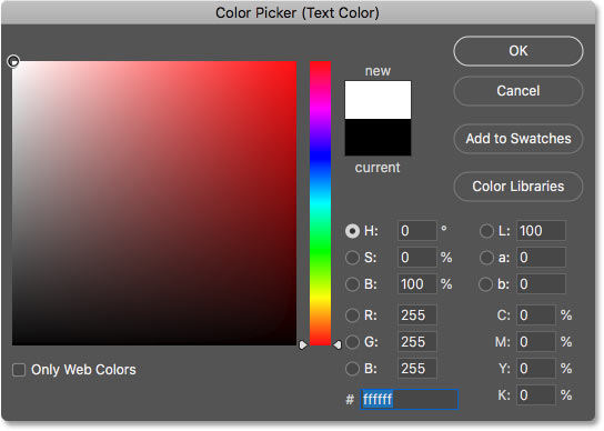
Setting the type color to white.
With your font and type color chosen, click inside the document and add your text. I'll type the word "FIRE". The text will look too small but we'll fix that next:
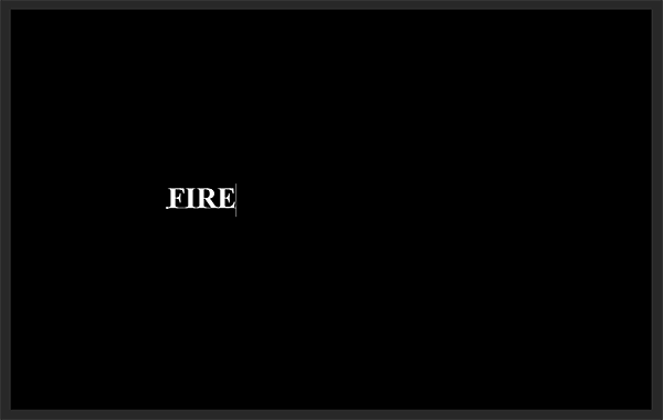
Adding the text.
To accept it, click the checkmark in the Options Bar:
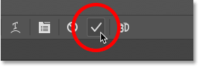
Clicking the checkmark.
Step 4: Resize and move the text with Free Transform
To resize the text, go up to the Edit menu and choose Free Transform:
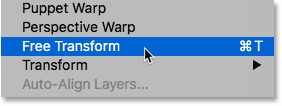
Going to Edit > Free Transform.
Then press and hold your Shift key and drag any of the corner handles outward. Holding the Shift key locks the shapes of the letters in place so you don't distort them. When you're done, release your mouse button, and then release your Shift key:
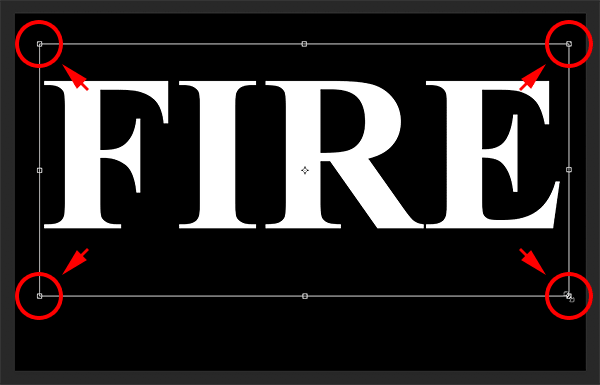
Holding Shift and dragging the corner handles to resize the text.
To move the text, click inside the Free Transform box and drag it into place. Make room for the flames along the top of the letters by dragging the text downward into the lower half of the document:
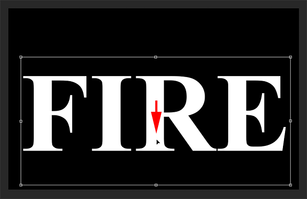
Dragging the text into position.
To accept it, again click the checkmark in the Options Bar:
Clicking the checkmark to close Free Transform.
Part 2: Drawing the flames around the text
Step 5: Rasterize the type
In the Layers panel, we see our text on a Type layer above the Background layer:
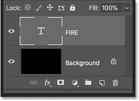
The Layers panel showing the Type layer.
Convert the text into pixels by right-clicking (Win) / Control-clicking (Mac) on the Type layer and choosing Rasterize Type from the menu:
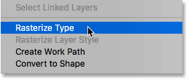
Choosing the Rasterize Type command.
Photoshop converts the text into a normal layer:
The type has been converted to pixels.
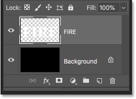
Step 6: Duplicate the text layer
Make a copy of the layer by dragging it down onto the New Layer icon at the bottom of the Layers panel:
Duplicating the text layer.
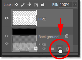
Step 7: Turn the copy off
A copy appears above the original. Turn the copy off for now by clicking its visibility icon:
Turning off the top layer.
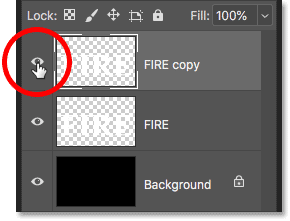
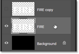
Step 8: Select the original text layer
Then click on the original text layer to select it:
Step 9: Rotate the text 90° clockwise
We're ready to create our flames, and we'll start by applying Photoshop's Wind Filter. Problem is, the Wind filter only works from left to right, or right to left. It doesn't work vertically, and we need our flames to look like they're rising up above the letters. So, before we apply the filter, we first need to rotate the text. Go up to the Image menu, choose Image Rotation, and then choose 90° Clockwise:
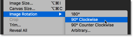
Going to Image > Image Rotation > 90° Clockwise.
This rotates the entire document, including the text, onto its side:
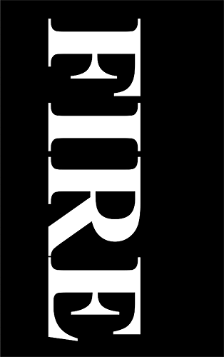
The text after rotating the image clockwise.
Step 10: Apply the Wind filter
With the text rotated, go up to the Filter menu, choose Stylize, and then choose Wind:
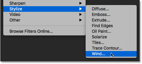
Going to Filter > Stylize > Wind.
In the Wind dialog box, set the Method to Wind and the Direction to From the Left, and then click OK:
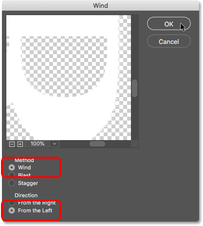
Set the Method to "Wind" and the Direction to "From the Left".
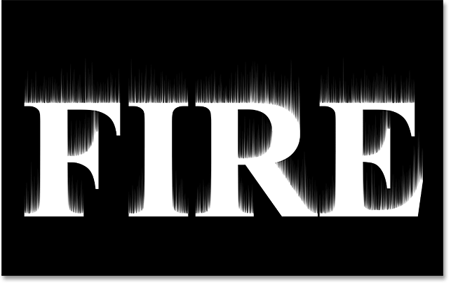
If you look closely, you'll see little streaks or spikes extending outward along the right edges of each letter. Here I've zoomed in on the letter F to make them easier to see:
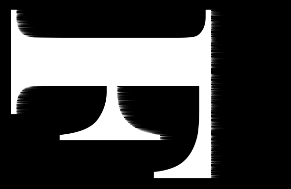
Small streaks appear along the right edges.
Step 11: Re-apply the Wind filter two more times
To make the streaks longer, apply the Wind filter again. Go back up to the Filter menu, and because Wind was the last filter we applied, you'll find it at the top of the list:

Running the Wind filter a second time by going to Filter > Wind.
After running it a second time, the streaks are more visible:
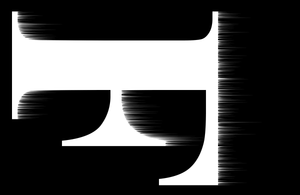
The effect after running the Wind filter a second time.
Apply the Wind filter a third time by again choosing it from the top of the Filter menu:
Running the Wind filter a third time.
And now the streaks are as long as we need:
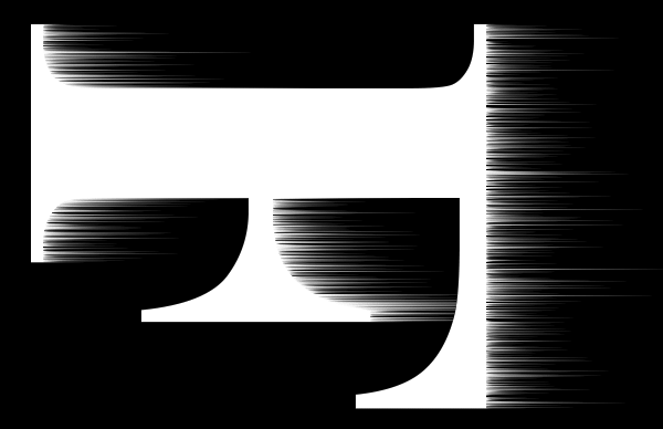
The effect after three passes of the Wind filter.
Step 12: Rotate the text 90° counter clockwise
We're done with the Wind filter, so rotate the text back to its original orientation by going up to the Image menu, choosing Image Rotation, and this time, choosing 90° Counter Clockwise:
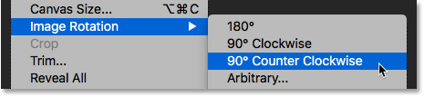
Going to Image > Image Rotation > 90° Counter Clockwise.
With the text rotated, the streaks now rise upward towards the top:
The image is now back to its original position.
Step 13: Apply the Gaussian Blur filter
To soften the streaks, apply some blurring. Go up to the Filter menu, choose Blur, and then choose Gaussian Blur:
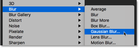
Going to Filter > Blur > Gaussian Blur.
In the Gaussian Blur dialog box, choose a low Radius value of around 1 pixel, and then click OK:
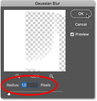
Blurring the Wind filter effect to soften it.
The streaks now have a softer look to them:
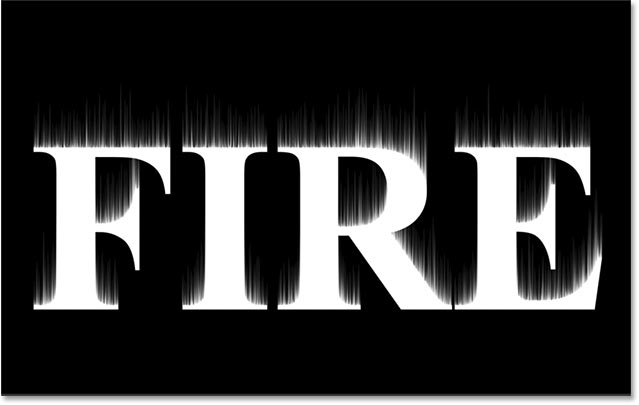
The effect after applying Gaussian Blur.
Step 14: Duplicate the Background layer
Back in the Layers panel, make a copy of the Background layer by dragging it down onto the New Layer icon:
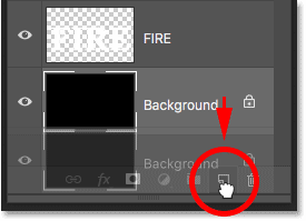
Duplicating the Background layer.
A copy appears above the original:
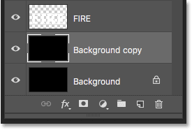
The new "Background copy" layer.
Step 15: Merge the text and Background copy layers
Merge the text layer with the "Background copy" layer by clicking on the text layer to select it:
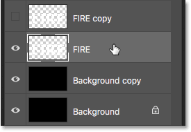
Selecting the text layer.
And then right-clicking (Win) / Control-clicking (Mac) on the layer and choosing Merge Down from the menu:
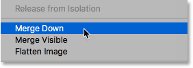
Choosing the Merge Down command.
This merges both layers onto a single layer:
The text and "Background copy" layers are now merged into one.
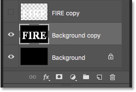
Step 16: Rename the merged layer "Flames"
Double-click on the name "Background copy" to highlight it, and then rename the layer "Flames". Press Enter (Win) / Return (Mac) to accept it:
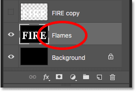
Renaming the merged layer "Flames".
Step 17: Draw flames with the Liquify filter
With the "Flames" layer selected, go up to the Filter menu and choose Liquify:
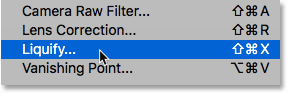
Going to Filter > Liquify.
Select the Forward Warp Tool
In the Liquify filter dialog box, make sure the Forward Warp Tool is selected in the toolbar along the left:
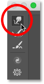
Selecting the Forward Warp Tool.
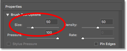
Set the brush size
Then, in the Brush Tool Options on the right, set the Size of your brush to around 100 pixels:
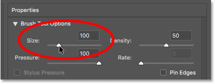
Starting with a 100 pixel brush.
Warp the streaks
The first thing we need to do is give the streaks we created with the Wind filter more of a wispy look to them. Click inside the streaks at different spots and drag your mouse a short distance, either left or right, to gently warp them and create subtle, random curves. Just click, drag, release your mouse button, and then click and drag again in a different area. Try not to click inside the letters themselves for now. Just warp and wiggle the streaks:
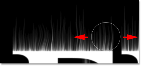
Dragging left and right along the streaks to warp them.
Fix mistakes with the Reconstruct Tool
If you make a mistake, undo your last step by pressing Ctrl+Z (Win) / Command+Z (Mac). Or, select the Reconstruct Tool from the toolbar and then paint over the area to undo the warping that was applied. Once you've cleared away the mistake, switch back to the Forward Warp Tool and continue warping the streaks:
You can undo the warp using the Reconstruct Tool.
Don't forget to include the streaks in the middle and bottom sections of the letters. If you need to adjust your brush size, press the left and right bracket keys on your keyboard. The left bracket ( [ ) makes the brush smaller and the right bracket ( ] ) makes it larger. When you're done, you should end up with something similar to what I have here:

The streaks after adding the initial warp.
Lower the brush size and draw small flames
Back in the Brush Tool Options, lower the Size of your brush to around 20 pixels:
Lowering the brush size.
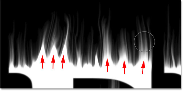
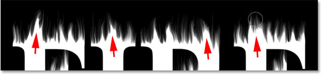
This time, to create small flames, click inside the letters and drag upward into the streaks. Try to drag in different directions for variety, or even follow the path of the streaks for added effect:
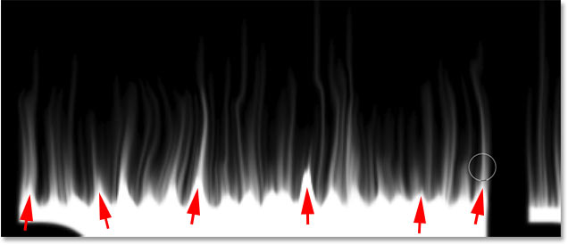
Drawing small flames along the tops of the letters.
Again if you make a mistake, press Ctrl+Z (Win) / Command+Z (Mac) to undo your last step. When you're done with the tops of the letters, do the same thing with the bottom and middle sections. The result should look something like this:
The result after drawing the small flames.
Increase the brush size and draw larger flames
Increase your brush size to around 50 pixels:
Choosing a larger brush size.
Then click on random spots inside the letters and drag upward to create larger flames. Again drag in different directions for variety:
Drawing some larger flames with the larger brush.
Here's my result after adding the larger flames:
The larger flames have been added.
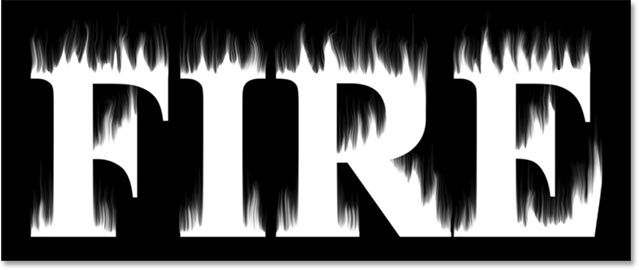
Increase the brush size and draw the largest flames
Finally, increase your brush size to around 70 pixels:
Setting the brush size to 70 pixels.
And then click and drag to add a few even larger flames along the tops. One per letter should do it:
Adding a few larger flames to enhance the effect.
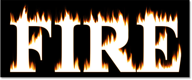
When you're done, click OK to close the Liquify filter, and here's my result:
Part 3: Coloring the flames
Step 18: Add two Hue/Saturation adjustment layers
At the moment, our flames are just white, so let's add some color to them.
Add the first Hue/Saturation adjustment layer
In the Layers panel, click the New Fill or Adjustment Layer icon at the bottom:
Adding a new adjustment layer.
Then choose Hue/Saturation from the list:
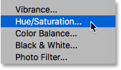
Choosing Hue/Saturation.
The adjustment layer appears directly above the "Flames" layer:
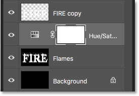
The first Hue/Saturation adjustment layer is added.
And the controls and options for the adjustment layer appear in Photoshop's Properties panel. First, turn on the Colorize option. Then set the Hue value to 40 and the Saturation to 100:
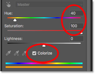
The Hue/Saturation controls in the Properties panel.
This adds a warm yellow to the tops of the flames:
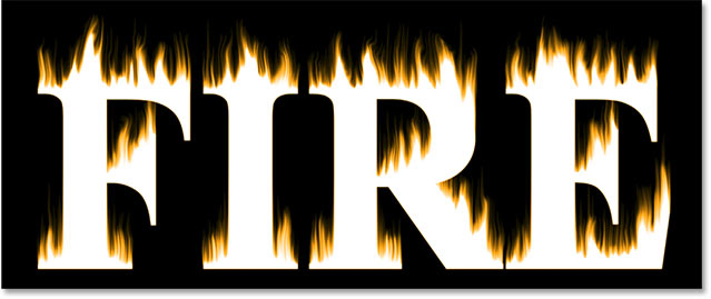
The result with the first Hue/Saturation adjustment layer.
Add a second Hue/Saturation adjustment layer
Add a second Hue/Saturation adjustment layer by again clicking the New Fill or Adjustment Layer icon in the Layers panel:
Clicking the New Fill or Adjustment Layer icon.
And choosing Hue/Saturation from the list:
Again choosing Hue/Saturation.
In the Properties panel, this time leave the Colorize option unchecked, and just set the Hue value to -15:
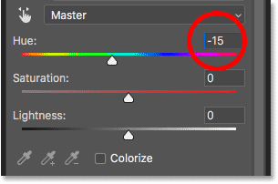
Setting the Hue to -15.
This changes the color of the flames from yellow to orange:
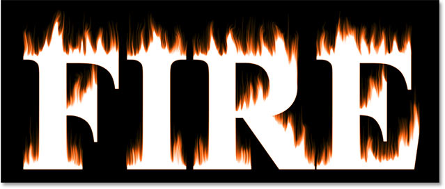
The result with the second Hue/Saturation adjustment layer.
Step 19: Change the blend mode to Overlay
To blend the colors from the two Hue/Saturation adjustment layers together, change the blend mode of the second one from Normal to Overlay:
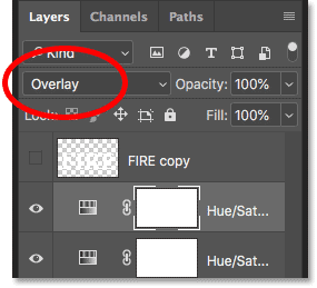
Changing the layer blend mode to Overlay.
This blends both the orange and the yellow together:
The result after changing the blend mode.
Step 20: Add a Levels adjustment above the "Flames" layer
To change the remaining white areas to yellow, select the "Flames" layer:
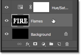
Selecting the "Flames" layer.
Then click the New Fill or Adjustment Layer icon:
Clicking the New Fill or Adjustment Layer icon.
And this time, choose Levels:
Adding a Levels adjustment layer.
Photoshop adds the Levels adjustment layer directly above the "Flames" layer:
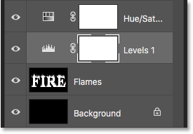
The Levels adjustment layer is added.
Step 21: Lower the max-brightness Output level
In the Properties panel, you'll see two values for the Output Levels; one set to 0 and the other to 255. The first value controls the minimum brightness level of the layers below the adjustment layer, and the second controls the maximum brightness. To fade the flames and the text from white to yellow, lower the second value from 255 down to 185:
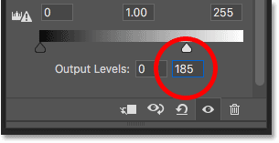
Lowering the max brightness Output level to 185.
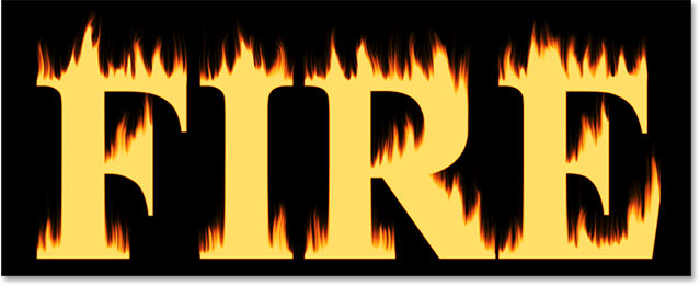
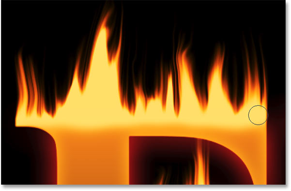
And here's the result. The white areas are now yellow, but the orange highlights still remain along the tops of the flames:
Part 4: Coloring the text
Now that we've added some color to the flames, let's color the text itself. And we'll do that using Photoshop's layer effects.
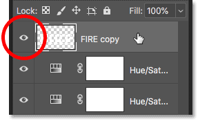
Step 22: Select and turn on the top layer
Back in the Layers panel, click on the top layer (the "FIRE copy" layer) to select it, and then turn the layer on by clicking its visibility icon:
Selecting and turning on the text layer.
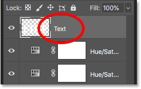
Step 23: Rename the layer
Since this is our main text layer, double-click on its name to highlight it, and then rename the layer "Text". Press Enter (Win) / Return (Mac) to accept it:
Renaming the top layer "Text".
Step 24: Add a Gradient Overlay layer effect
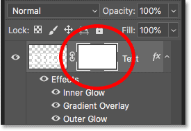
With the "Text" layer selected, click on the Layer Styles icon (the "fx" icon) at the bottom of the Layers panel:
Clicking the Layer Styles icon.
And then choose Gradient Overlay from the list:
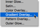
Adding a Gradient Overlay layer effect.
Resetting the gradient defaults
This opens Photoshop's Layer Style dialog box set to the Gradient Overlay options. First, click the Reset to Default button to make sure we're starting from the default settings:
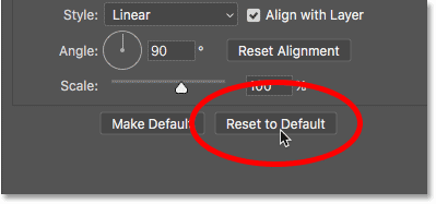
Resetting the Gradient Overlay to its default settings.
Editing the gradient
To edit the gradient, click the color swatch:
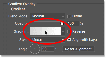
Clicking the color swatch.
In the Gradient Editor, double-click on the color stop below the left end of the gradient:
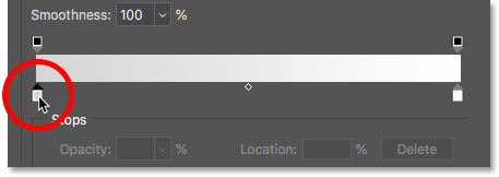
Editing the left color.
Then, in the Color Picker, choose a dark red by setting the Hue (H) value to 7, the Saturation (S) value to 100 and the Brightness (B) value to 27. Click OK to close the Color Picker:
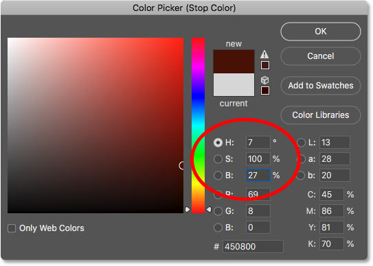
Setting the left gradient color to dark red.
Back in the Gradient Editor, double-click on the color stop below the right end of the gradient:

Editing the right color.
And in the Color Picker, choose a brighter orange by setting the Hue to 30, the Saturation to 95 and the Brightness to 96:
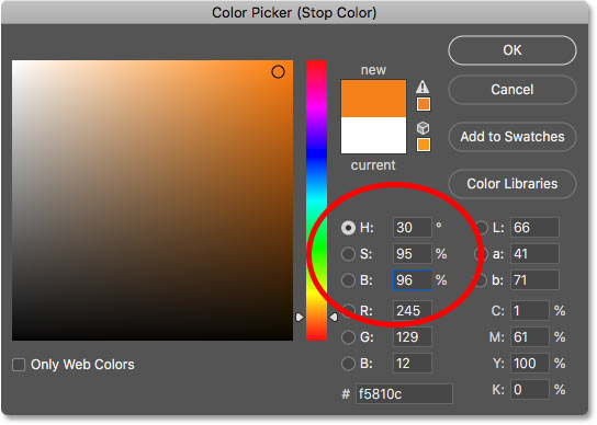
Setting the right gradient color to orange.
Click OK to close the Color Picker, and then click OK to close the Gradient Editor, but leave the Layer Style dialog box open. The text is now colored with the gradient:
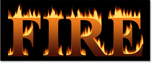
The result after adding the Gradient Overlay to the text.
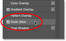
Step 25: Add an Outer Glow layer style
In the Layer Style dialog box, choose Outer Glow from the list of effects along the left:
Adding an Outer Glow layer effect.
Then, in the Outer Glow options, click the color swatch to change the glow's color:
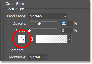
Clicking the Outer Glow's color swatch.
And in the Color Picker, choose a bright red. I'll set my Hue value to 0, the Saturation to 95, and the Brightness also to 95. Then click OK to close the Color Picker:
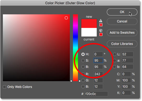
Choosing a bright red for the Outer Glow.
Back in the Outer Glow options, adjust the Opacity to control the brightness of the glow, and the Size to control the distance that the glow extends outward from the text. I'll set my Opacity to 60% and the Size to 40 pixels:
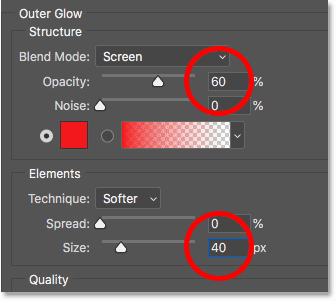
Setting the opacity and size of the Outer Glow.
Here's the effect with the red glow applied around the letters:
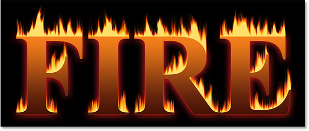
The result with the Outer Glow applied.
Step 26: Add an Inner Glow
Still in the Layer Style dialog box, select Inner Glow on the left:
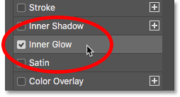
Adding an Inner Glow layer effect.
In the Inner Glow options, click the color swatch:
Changing the Inner Glow's color.
And in the Color Picker, choose a bright orange. I'll set the Hue to 20, the Saturation to 100 and the Brightness to 90. Click OK when you're done to close the Color Picker:
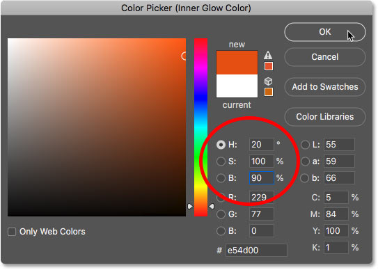
Choosing orange for the Inner Glow.
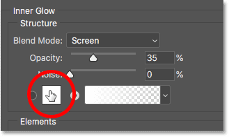
And finally, back in the Inner Glow options, increase the Opacity all the way to 100%, then set the Size to around 24 pixels:
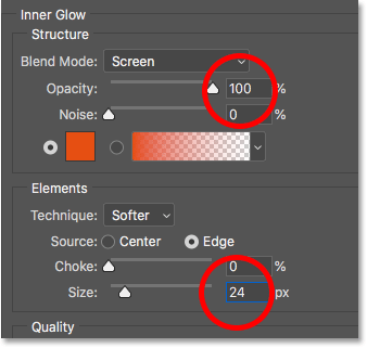
Setting the opacity and size of the Inner Glow.
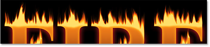
We're done with our layer styles, so click OK to close the Layer Style dialog box. Here's the result with all three layer effects applied to the text:
The result with all three layer effects applied.
Part 5: Blending the text with the flames
At the moment, the text looks like it's sitting in front of the flames. We'll blend the text into the flames using a layer mask.
Step 27: Add a layer mask to the text layer
With the "Text" layer still active, click the Add Layer Mask icon at the bottom of the Layers panel:
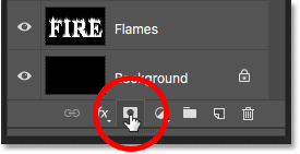
Adding a layer mask to the "Text" layer.
A white layer mask thumbnail appears next to the "Text" layer's preview thumbnail:
The layer mask thumbnail.
Step 28: Select the Brush Tool
Grab the Brush Tool from the Toolbar:
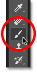
Selecting the Brush Tool.
Step 29: Set your brush color to black
We need to paint on the layer mask with black, so make sure your Foreground color (the brush color) is set to black:

Set your brush color to black.
Step 30: Paint along the letter edges to blend in the flames
Right-click (Win) / Control-click (Mac) inside the document to bring up the brush options. Then lower the Hardness to 0% so you're painting with a soft brush, and set the Size to between 30-40 px. Press Enter (Win) / Return (Mac) to close the brush options:
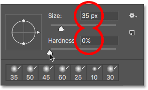
Set the size and hardness of the brush.
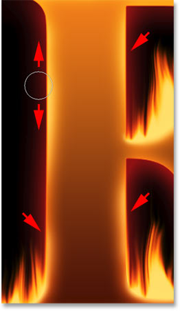
Then, start by painting along the tops of the letters. The sharp edges of the text will disappear into the flames. Try to paint with more of a wavy line rather than a straight line:
Painting along the top of the first letter to blend the edge into the flames.
If you make a mistake, press Ctrl+Z (Win) / Command+Z (Mac) to undo it. Then continue painting until the top of each letter looks like it's melting in the fire:
The result after blending the top of the letters.
When you've finished with the tops, do the same thing with the middle and bottom edges of the letters, painting along them to blend them into the flames. Use the left and right bracket keys on your keyboard if you need to adjust the brush size:

Paint along the other edges to blend them into the flames as well.
To add to the effect, use a larger brush (press the right bracket key a few times) and paint along other edges of the letters to add a glow to those areas. Keep most of your brush cursor outside the letter so only the outer edge passes over it:
Painting along random parts of the edges to add a glow.
Here's my result after painting along the edges. We're almost done:
Written by Rajeev Tiwari
Thank u so much


Comments
Post a Comment